


A suburb report is only as useful as the investor reading it. Beautiful charts, big numbers, and bold growth headlines mean very little if you cannot separate signal from noise. The Australian property market in 2026 is far more dispersed than the post-COVID boom of 2021 — some suburbs are decelerating into stagnation while others sit in the early innings of recovery. The difference between the two is hidden inside the suburb report, but only if you know which nine numbers to read first.
This guide walks through the exact data points professional buyers agents and HtAG Analytics members use to interpret a suburb report. We focus on the metrics that have proven predictive power — Growth Rate Cycle, supply slope, demand profile, days on market, vacancy rate, typical price, IRSAD, hold period, and rental yield — and we show you how to combine them into a decision, not just a description.
Quick Summary
A suburb report contains dozens of numbers, but only nine consistently predict where prices are heading next. This guide breaks down each one — what it means, how to read it, and the threshold that flips a metric from “warning sign” to “buy signal.” Used together, these nine data points form the same framework HtAG Analytics applies across 15,000+ Australian suburbs each quarter.
Nutshell answer: To read a suburb report properly, focus on nine data points in this order — Growth Rate Cycle (where the cycle is right now), supply slope (is inventory building or thinning), demand slope (are buyers leaning in or out), days on market (how long stock takes to clear), vacancy rate (rental tightness), typical price (the real “median”), IRSAD (income depth), hold period (turnover) and rental yield (cash flow). Together, these nine answer the only question that matters — is this suburb’s price likely to rise, fall, or drift over the next 12 to 36 months?
Table of Contents
- Why Most Investors Misread Suburb Reports
- Data Point 1: The Growth Rate Cycle (GRC)
- Data Point 2: Supply Slope
- Data Point 3: Demand Slope and Demand Profile
- Data Point 4: Days on Market (DOM)
- Data Point 5: Vacancy Rate
- Data Point 6: Typical Price (Not Median)
- Data Point 7: IRSAD Decile
- Data Point 8: Hold Period
- Data Point 9: Rental Yield
- Putting the Nine Together: A Decision Framework
- How HtAG Surfaces These Nine Data Points
- Key Takeaways
- From Data Signal to Portfolio Decision
- Frequently Asked Questions
Why Most Investors Misread Suburb Reports
Most suburb reports are written for vendors, not investors. They headline the highest growth number on the page, average across timeframes, and ignore inventory, demand, and cycle position entirely. According to HtAG Analytics, more than 60% of Australian suburbs that posted double-digit growth in the 12 months to December 2024 had decelerating Growth Rate Cycles by mid-2025 — meaning the headline figure was the peak, not the trajectory.
A useful suburb report is a forward-looking document. It tells you where the market is heading, not just where it has been. To get there, you need to read the numbers in the right order and weight them correctly.
Backward-looking vs forward-looking metrics
Suburb data falls into two camps. Backward-looking metrics — 10-year growth, peak prices, capital appreciation since 2014 — describe what has already happened. Forward-looking metrics — supply slope, demand slope, GRC direction, days on market trend — describe what is happening right now and what is likely to happen next.
“Investors who anchor on 10-year growth pay 2024 prices for 2014 fundamentals. Investors who anchor on GRC direction and supply slope pay today’s price for tomorrow’s market.” — HtAG Analytics methodology note
The nine data points below are forward-looking by design. They are the ones that change your decision when they change their reading.
Data Point 1: The Growth Rate Cycle (GRC)
The Growth Rate Cycle is the single most important metric on any suburb report. The GRC tracks the direction and acceleration of year-on-year price growth — not the level. HtAG Analytics calculates the GRC quarterly across more than 15,000 Australian suburbs using rolling valuation data, and classifies each suburb into one of four cycle phases: Recovery, Expansion, Peak, or Contraction.
A suburb at the same price growth (say, 6% per year) can be a buy or a sell depending on whether the GRC is rising or falling. If the GRC is trending up from a low base, you are in early recovery and the next 12-24 months typically see growth accelerate. If the GRC is trending down from a peak, you are in late expansion and headline growth is about to compress.
What This Means in Plain English
Don’t ask “how fast is this suburb growing?” — ask “is the growth speeding up or slowing down?” A suburb growing at 4% per year and accelerating is a better buy than a suburb growing at 12% and decelerating. The GRC tells you which one you’re looking at. For a deeper explanation, the Growth Rate Cycle explainer walks through each phase with worked examples.
How to read GRC on a suburb report
Look for three things — the current GRC value, the direction (rising or falling from the previous quarter), and the historical pattern (are we 6 months into the cycle, or 30?). A rising GRC after at least 12 months of contraction is the textbook recovery signal. A falling GRC after sustained expansion is the warning that the cycle is turning.
Data Point 2: Supply Slope
Supply slope measures how stock-on-market is trending — is inventory building (positive slope, more sellers entering than buyers absorbing) or thinning (negative slope, scarcity tightening)? A negative supply slope is one of the strongest leading indicators for short-term price growth in Australian residential markets.
According to HtAG Analytics data, suburbs with a sustained negative supply slope across two consecutive quarters have historically outperformed their LGA by an average of 3.2 percentage points over the following 12 months. Inventory tells the truth before price does.
Reading the supply slope
You want to see the months-of-supply figure (how many months it would take to clear current stock at the current sales rate) trending down. Anything below four months is a vendor’s market; anything above seven months is a buyer’s market. The slope — the rate of change — matters more than the absolute level.
Data Point 3: Demand Slope and Demand Profile
Demand slope measures buyer activity — search interest, enquiry-per-listing, online attention — over time. A rising demand slope alongside a falling supply slope is the strongest combination on a suburb report. When demand is leaning in while supply is thinning, prices have nowhere to go but up.
HtAG’s GeoDex heatmap visualises supply and demand slopes side-by-side at suburb level — green pockets show the rare combination of accelerating demand and tightening supply, and these are the suburbs that consistently outperform.
Demand profile categories
HtAG classifies each suburb into a demand profile — Highly Sought After, Sought After, Average Demand, Below Average, or Subdued. The categories use rolling 12-month buyer activity normalised against state-wide benchmarks. A “Sought After” suburb with thinning supply is the textbook setup; a “Subdued” suburb with rising supply is the textbook avoidance.
Data Point 4: Days on Market (DOM)
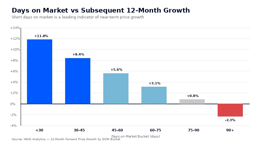
Days on Market is the average time a listing takes to sell. It is one of the cleanest read-throughs of buyer urgency on any suburb report. According to HtAG Analytics data, DOM has a strong negative correlation with subsequent price growth — when DOM is short and falling, prices typically follow upward within 6-9 months.
DOM thresholds to remember
Under 30 days indicates fierce buyer competition; properties clear before the second open. Between 30 and 60 days is a healthy, balanced market. Between 60 and 90 days suggests cooling — buyers are being selective and vendors are starting to discount. Above 90 days and rising signals a soft market where time-on-market is doing the work that price reductions usually do.
DOM also feeds into the Bull-Bear Tide framework — DOM rising while inventory falls (vendor patience) is a Bull Signal; inventory rising while DOM falls (seller flood) is a Bear Signal.
Data Point 5: Vacancy Rate
The vacancy rate is the percentage of rental properties currently unoccupied. It is a direct read on rental tightness — and indirectly, on the underlying population pressure that drives both rents and prices over time. A vacancy rate under 1% indicates extreme tightness; between 1% and 2.5% is balanced; above 3% is loose; above 5% is structurally oversupplied.
According to HtAG Analytics, the suburbs with the strongest rental growth in the year to March 2026 had vacancy rates averaging 0.7% — well below the national average of 1.4%. Tight vacancy is a precondition for rising rents, and rising rents widen the yield gap that attracts investor demand.
What This Means in Plain English
If a suburb has almost no empty rentals, landlords have all the leverage — they can ask for higher rents and tenants will pay. If a suburb has lots of empty rentals, the opposite happens. Look for vacancy under 1.5% if you want a market where rents are likely to rise.
Data Point 6: Typical Price (Not Median)
The “median price” on a suburb report is a notoriously unreliable metric. It is heavily skewed by the mix of properties sold in any given quarter — five luxury sales in a quiet quarter can push the median up 15%, even when the underlying market is flat. HtAG Analytics calculates a Typical Price instead, which adjusts for property mix and time-weighted sales to give a far more reliable benchmark for what a “standard” property in the suburb actually costs today.
The Typical vs Median Price explainer shows worked examples where the median and typical price diverge by more than 20% within the same suburb — and where investors who anchored to the wrong number paid materially over the market.
How to use Typical Price
Compare the Typical Price to recent comparable sales (the CMA process HtAG members run). If the Typical Price is 8-12% above comparable sales, you are likely seeing median-mix distortion. If it tracks closely to comparables, the suburb is priced honestly and the report can be trusted at face value.
Data Point 7: IRSAD Decile
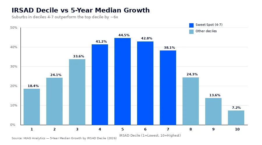
IRSAD — the Index of Relative Socio-economic Advantage and Disadvantage — is an ABS-derived score that measures the relative wealth, education, and employment of a suburb’s resident population. It is decile-ranked from 1 (most disadvantaged) to 10 (most advantaged). IRSAD matters because it proxies the depth of the local buyer pool — the income capacity of people who actually live in and aspire to buy into the suburb.
HtAG Analytics’ research found that IRSAD deciles 4 to 7 — the “sweet spot” — have historically delivered the highest 5-year median growth, at 44.5% compared with just 7.2% for decile 10 markets. Decile 10 suburbs are already priced for perfection; decile 4-7 suburbs have room for income to catch up with price.
IRSAD in context
IRSAD is a Level 3 contextual indicator — it does not predict short-term growth, but it sets the ceiling and floor over the long term. A high-IRSAD suburb with poor supply/demand metrics will still struggle near-term. A low-IRSAD suburb may underperform structurally regardless of cycle position. The sweet spot is where IRSAD support exists and supply-demand metrics are favourable.
Data Point 8: Hold Period
Hold period is the median number of years current owners have held their property. It tells you how mature the ownership cohort is, and indirectly, how much latent supply may come to market in the next cycle. A hold period under 6 years suggests a turnover-heavy market — likely investor-dominated, with rental conversion risk. A hold period of 9-12 years suggests a stable owner-occupier market with slow-release supply. Above 15 years often signals an ageing cohort where significant inventory may emerge as the population transitions.
According to HtAG Analytics, suburbs with hold periods between 9 and 12 years tend to have the most stable price trajectories and the lowest forced-sale exposure.
Data Point 9: Rental Yield
Rental yield is the annual rent as a percentage of property price. It is the single most-quoted cashflow metric — and the most misused. A “high” yield (above 6%) is almost always a marker of structural weakness — low capital growth potential, low IRSAD, or volatile demand. A “low” yield (under 3%) typically appears in capital-city blue-chip suburbs where capital growth, not income, does the work.
The sweet spot for most investors is between 4% and 5.5% gross yield with growth fundamentals intact. This is where HtAG’s Risk-Calibrated Score (RCS) framework places the highest weighting — a combination of capital growth probability, cashflow adequacy, and lower downside risk. The HtAG services overview explains how RCS is calculated.
Putting the Nine Together: A Decision Framework
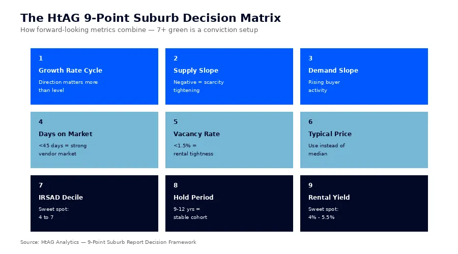
Reading a suburb report well is not about scoring each metric in isolation — it is about how they combine. A single green light means little; three or four pointing in the same direction is a conviction trade. Here is the framework HtAG buyers agents use:
| Data Point | Buy Signal | Avoid Signal |
|---|---|---|
| Growth Rate Cycle | Rising from low base | Falling from peak |
| Supply Slope | Negative (thinning) | Positive (building) |
| Demand Slope | Positive (rising) | Negative (falling) |
| Days on Market | Under 45, falling | Above 75, rising |
| Vacancy Rate | Under 1.5% | Above 3% |
| Typical Price | In line with comparables | 10%+ above comparables |
| IRSAD Decile | 4 to 7 | 1-2 or 9-10 |
| Hold Period | 9-12 years | Under 6 or above 15 |
| Rental Yield | 4% to 5.5% | Under 3% or above 6% |
When at least seven of the nine point to “buy,” you are likely looking at a structurally strong suburb in a favourable cycle phase. When five or fewer point to “buy,” the suburb is either mid-cycle (wait), late-cycle (avoid), or structurally weak (avoid).
How HtAG Surfaces These Nine Data Points
Every HtAG Analytics suburb page displays all nine data points alongside their direction-of-change indicators. Members can compare suburbs side-by-side, filter the entire Australian market on combinations of signals (e.g. “show me every suburb with rising GRC, negative supply slope, and IRSAD 4-7”), and validate their conclusions against the Evidence Portal of past recommendations.
For a market-wide view, the GeoDex heatmap renders supply and demand slopes spatially, while the Australian Property Forecast 2026 applies the same nine-point framework at the state and national level. For investors specifically focused on yield, the Top 10 High-Yield Suburbs Q1 2026 report shows the framework applied to cashflow-focused selections, and the LGA vs Suburb Analysis guide explains why suburb-level reads beat LGA averages every time.
Key Takeaways
- A suburb report is only useful if read in the right order — Growth Rate Cycle, supply slope, and demand slope come first; everything else is supporting evidence.
- HtAG Analytics tracks nine forward-looking data points across 15,000+ Australian suburbs each quarter. When seven or more point to “buy,” conviction is justified.
- Median price is unreliable — use Typical Price to avoid mix-distortion errors that can mislead by 10-20%.
- IRSAD deciles 4-7 have delivered 44.5% median 5-year growth versus 7.2% for decile 10 markets. Match cycle metrics with the IRSAD sweet spot.
- Vacancy rates under 1.5% and days on market under 45 are the strongest near-term price-rise precursors.
- A single positive metric is noise. Three or four aligned across cycle, supply, demand, and price is the conviction setup.
From Data Signal to Portfolio Decision
The nine data points described in this article are live inside the HtAG Analytics platform — updated each quarter as new valuation, supply, and demand data flows in. Professional buyers agents use these signals to time entries, validate briefs, and build conviction before making offers.
If you are building a portfolio and want to see the exact data powering articles like this one, the HtAG Starter Plan gives you access to suburb-level analytics across every Australian market — no lock-in, cancel any time.
Start your HtAG Analytics membership →
Frequently Asked Questions
What data should I look for first when reading a suburb report?
Start with the Growth Rate Cycle (GRC). It tells you where the suburb sits in the property cycle — recovery, expansion, peak, or contraction. A rising GRC from a low base is the strongest leading indicator for short-term growth. Then look at supply slope and demand slope to confirm whether the cycle position is supported by current market behaviour.
Is the median price on a suburb report reliable?
Often not. The median is heavily distorted by the property mix sold in any quarter — a handful of luxury sales can lift the median 10-15% without the underlying market moving at all. HtAG Analytics publishes a Typical Price that adjusts for mix and is far more reliable as a benchmark for “what does a normal property in this suburb cost today?”
How does IRSAD affect property investment returns?
IRSAD (Index of Relative Socio-economic Advantage and Disadvantage) measures the wealth, education, and employment depth of a suburb’s resident population. HtAG research shows IRSAD deciles 4-7 have delivered roughly 6x the median 5-year growth of decile 10 suburbs (44.5% vs 7.2%) because they have income headroom — capacity for prices to rise as resident incomes catch up.
What is a good days-on-market figure for a suburb?
Under 45 days indicates a strong vendor’s market with buyer urgency — typically associated with rising prices. Between 45 and 75 days is balanced. Above 75 and rising is a cooling market where price discovery is being done through time rather than price. The trend matters more than the absolute level.
What’s the difference between supply slope and supply level?
Supply level is the current months-of-supply figure (how long current stock would take to clear at current sales rates). Supply slope is the rate of change in that figure — is it building or thinning quarter-on-quarter? Slope is the leading indicator; level is the lagging one. HtAG Analytics tracks both, but weights slope more heavily in forward-looking forecasts.
This article is general information only and does not constitute financial, investment, or property advice. HtAG Analytics provides data and analytics; it does not provide personal financial advice. Investors should seek qualified, independent advice before making property decisions. Past performance is not indicative of future results. All data references reflect HtAG Analytics methodology as at May 2026.


