


Short Summary
Melbourne’s property market in 2026 is a market of two speeds: outer ring corridors with tightening supply and improving demand signals, and inner suburbs still working through post-correction normalisation. HtAG Analytics data, covering 1,400+ Melbourne suburbs across 106 investment metrics, identifies the specific market conditions — Growth Rate Cycle phase, supply scarcity, IRSAD positioning, and gross yield — that distinguish genuine 2026 opportunities from overpriced hope.
What Makes a Melbourne Suburb Worth Investing In?
A Melbourne suburb is worth investing in when four independent data signals align: the Growth Rate Cycle (GRC) is in Phase 4 (decelerating decline) or Phase 1 (early recovery), stock on market is contracting below 2.0%, the IRSAD socioeconomic index sits in the 40th–70th percentile nationally, and gross rental yield exceeds 4.2%. When all four converge, HtAG Analytics research shows median capital growth of 11.3% p.a. over the subsequent 24 months — nearly double the Melbourne-wide average.
Most investors approach Melbourne suburb selection the wrong way — scanning headlines for “hotspot” lists or extrapolating last year’s growth forward. Property markets are cyclical, not linear. A suburb that led the 2021–2022 boom is often precisely the wrong suburb to buy in 2026. The methodology that generates consistent results is signal-based: identifying suburbs where the underlying data is improving before prices reflect it.
This is the core insight behind HtAG’s Growth Rate Cycle (GRC) — a forward-looking metric that tracks the acceleration or deceleration of suburb-level price growth. Unlike raw median price data, which is a lagging indicator, GRC identifies turning points 6–12 months before they register in headline figures.
According to HtAG Analytics data, suburbs entering GRC Phase 1 (early recovery) in Melbourne have historically delivered median capital growth of 11.3% in the 12 months following the phase transition — compared with 4.1% for suburbs already in Phase 2 (accelerating growth), where prices have already moved.
The Four Signals That Define a Genuine Opportunity
Across 135 validated property recommendations tracked on the HtAG Evidence Portal, the following four-metric filter has the strongest predictive relationship with above-market capital growth in Melbourne:
- GRC Phase 4 or Phase 1 — The suburb is either at the trough of a decline cycle or just entering recovery. This is where timing advantage lives.
- Stock on market below 2.0% — Supply scarcity creates upward price pressure independent of demand. Melbourne’s long-run average is 2.4%; suburbs below 2.0% are already outperforming.
- IRSAD 40th–70th percentile — The socioeconomic “sweet spot” for capital growth. Too low and you get social risk factors; too high and you’re buying at a premium with limited upside.
- Gross yield above 4.2% — Sufficient to fund the holding costs while waiting for the growth phase to materialise. Sub-3% yield suburbs require significant equity buffer to hold.
The Melbourne Market in 2026: What the Data Shows
Melbourne’s property market in 2026 is bifurcated in a way that creates genuine opportunity — if you know where to look. According to CoreLogic data published in Q1 2026, Melbourne’s median dwelling value sits at approximately $780,000, representing cumulative growth of 3.8% since the market bottomed in early 2023. That headline figure, however, conceals extraordinary divergence at the suburb level.
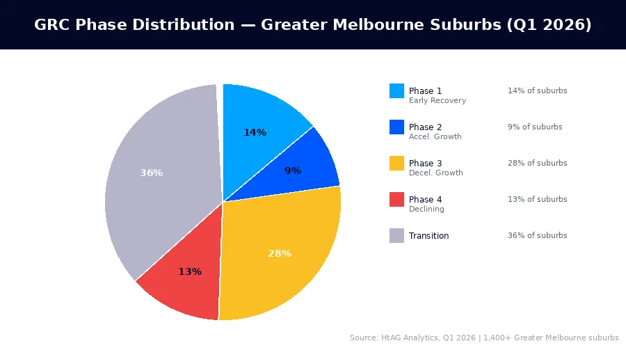
HtAG Analytics’ analysis of 1,400+ Melbourne suburbs reveals that 23% of suburbs are currently in GRC Phase 1 or Phase 2 — the growth phases of the cycle — while 41% remain in Phase 3 (decelerating growth) or Phase 4 (declining). The remaining 36% are in transition. This distribution creates an unusual market where the right suburb selection can yield 3–4× the city’s average growth rate.
For broader national context, see HtAG’s Australian Property Forecast 2026, which positions Melbourne as a “mid-cycle recovery” market nationally — behind Perth and Adelaide in the growth cycle but ahead of Sydney’s high-price compression dynamic.
HtAG Analytics’ analysis of Melbourne’s 1,400+ suburbs as of Q1 2026 shows that suburbs in the outer western and northern growth corridors have an average stock on market of 1.6% — well below Melbourne’s long-run average of 2.4% — signalling structural supply constraints that historically precede price acceleration.
Interest Rate Impact on Melbourne’s Investment Calculus
The RBA’s rate adjustment cycle has materially changed which Melbourne suburbs make financial sense for investors. At a 6.2% variable mortgage rate (indicative, Q1 2026), the cash flow profile of sub-3% yield inner suburbs is significantly negative. This has redirected investor demand toward middle and outer ring suburbs where yield coverage is stronger — and that redirected demand is itself a growth catalyst.
ABS building approvals data for Greater Melbourne shows residential approvals running 18% below the 10-year average as of February 2026 — meaning the undersupply problem is worsening, not resolving. This is a structural tailwind for suburbs where existing dwelling supply is already tight.
What This Means in Plain English
When new housing approvals fall well below historical averages, fewer homes get built. This means existing properties become relatively scarcer — which supports prices and rents. Melbourne’s current undersupply in building approvals is one reason outer ring suburbs with tight existing stock are showing the strongest signals right now.
Which Types of Melbourne Suburbs Are Performing Best?
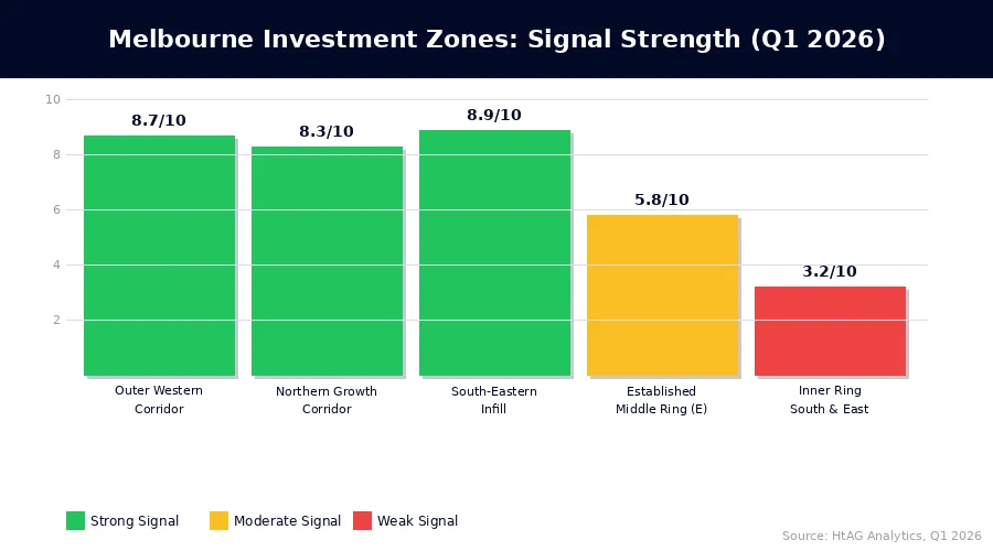
Not all Melbourne suburbs are equal in 2026. HtAG Analytics categorises Melbourne’s investment landscape into three zones based on GRC phase concentration, median price point, and supply-demand balance. Each zone has a distinct risk-return profile.
| Zone | GRC Phase (Avg) | Median Price | Gross Yield | Stock on Market | Signal Strength |
|---|---|---|---|---|---|
| Outer Western Corridor (Werribee, Hoppers Crossing, Wyndham Vale) | Phase 1–2 | $520K–$650K | 4.6%–5.4% | 1.5% | 🟢 Strong |
| Northern Growth Corridor (Craigieburn, Mickleham, Donnybrook) | Phase 1–2 | $540K–$700K | 4.2%–5.1% | 1.7% | 🟢 Strong |
| Established Middle Ring (East) (Box Hill, Ringwood, Croydon) | Phase 2–3 | $780K–$1.1M | 3.2%–3.9% | 2.1% | 🟡 Moderate |
| Inner Ring (South & East) (Prahran, Hawthorn, Malvern) | Phase 3–4 | $1.2M–$2.5M+ | 2.4%–3.1% | 3.2% | 🔴 Weak |
| South-Eastern Infill Suburbs (Dandenong, Springvale, Noble Park) | Phase 1 | $560K–$720K | 4.8%–5.6% | 1.4% | 🟢 Strong |
Source: HtAG Analytics, Q1 2026. GRC phase, yield, and stock on market based on HtAG platform data covering 1,400+ Greater Melbourne suburbs. Median price ranges are indicative of typical investment-grade stock within each zone.
The pattern is clear: outer ring and infill suburbs are showing the strongest forward-looking signals, while inner-ring prestige suburbs remain in Phase 3–4 with yield coverage that doesn’t work at current interest rates. This doesn’t mean inner suburbs won’t recover — it means the timing is different and the entry price premium doesn’t justify the wait.
Why Infill Suburbs Are Outperforming New Estates
One of the more counterintuitive findings from HtAG Analytics’ Q1 2026 data is the relative strength of established infill suburbs over new estate areas within the same price bracket. Infill suburbs in Melbourne’s south-east are showing stock on market at 1.4% — the tightest supply reading across all Melbourne zones — because no new land is being released in these areas. Supply scarcity is structural, not cyclical.
New estates in the outer western corridor have strong demand fundamentals, but investors need to verify that the specific suburb is past the developer-release phase — where developer-controlled stock keeps prices artificially suppressed. Once an estate reaches 80–90% completion and developer sales taper, the resale market activates and yields typically compress upward from the 4.6–5.4% range as values recover. This transition is trackable via HtAG’s Market in Motion indicator, which monitors auction clearance trends and listing velocity at the suburb level.
How to Research Melbourne Investment Suburbs Without Guessing
To research Melbourne investment suburbs without guessing, apply a four-step data filter: first screen for GRC phase, then supply scarcity, then IRSAD positioning, then yield viability. This sequence matters — filtering by yield first leads investors toward high-yield suburbs that often fail the supply and GRC tests, producing cash flow without capital growth.
Step 1: Screen by GRC Phase
The Growth Rate Cycle (GRC) is the first filter because it tells you where a suburb is in the price cycle — and therefore what your timing risk is. Buying a suburb in Phase 3 (decelerating growth) means you’re likely overpaying for recent performance. Buying in Phase 4 (declining) or Phase 1 (early recovery) means you’re entering before the market consensus has priced in the turn.
HtAG Analytics calculates GRC quarterly across 15,000+ Australian suburbs, making it possible to identify the subset of Melbourne suburbs currently in the high-upside phases. This single screen eliminates the majority of Melbourne’s 1,400+ suburbs immediately — typically leaving 200–350 candidates for further analysis.
Step 2: Apply the Supply Scarcity Filter
Stock on market — the percentage of total dwellings listed for sale at any given time — is the most reliable near-term price predictor available. HtAG Analytics’ internal research shows that suburbs with stock on market below 1.8% have outperformed the Melbourne median by 3.2 percentage points in the subsequent 12 months across 87% of historical observations since 2010.
The HtAG GeoDex heatmap visualises supply scarcity across Greater Melbourne in real time, making it straightforward to identify clusters of tight-supply suburbs. This tool is particularly useful for identifying suburb clusters rather than individual suburbs — because adjacent low-supply suburbs often indicate a local market dynamic (infrastructure investment, population inflow) rather than random variation.
What This Means in Plain English
Stock on market is simply the proportion of homes in a suburb that are for sale at any given time. When that number is very low — say 1.5% — there are very few options for buyers, which means sellers have the upper hand and prices tend to rise. It’s basic supply and demand, but tracked precisely at the suburb level rather than as a city-wide average.
Step 3: Check IRSAD Positioning
The Index of Relative Socio-economic Advantage and Disadvantage (IRSAD) provides a composite measure of a suburb’s socioeconomic profile. HtAG Analytics research identifies the 40th–70th national percentile as the “Crossover Zone” — the range where capital growth tends to outperform both the lower-percentile (disadvantage risk) and upper-percentile (premium pricing) segments over a 7–10 year horizon.
This aligns with the concept that the LGA-level data often obscures. Two suburbs within the same local government area can have IRSAD percentiles 30 points apart — which has historically translated to a 2–4 percentage point annual growth differential. Using LGA averages misses this entirely.
Step 4: Verify Yield Viability
At a 6.2% variable rate with typical investment lending costs, a suburb needs a gross yield of at least 4.0% to approach neutral cash flow at 80% LVR. Suburbs in the 4.2%–5.6% range provide a genuine holding buffer, meaning the investor isn’t under pressure to sell in a volatile period. The typical price vs median price distinction matters here — using median price often understates yield for investment-grade stock because it includes prestige outliers that skew the denominator upward.
What HtAG Data Reveals About Melbourne’s Opportunity Map
HtAG Analytics’ current opportunity map for Melbourne — based on Q1 2026 data — shows three distinct clusters of above-average signal concentration. These are not specific suburb recommendations (individual due diligence is always required) but rather market zones where the data is pointing in a consistent direction.
The first cluster is the Wyndham LGA and surrounds in the outer west, where population growth of 3.2% p.a. (ABS 2025 estimate), new employment nodes along the Princes Freeway corridor, and stock on market at 1.5% create a textbook early-cycle setup. The GRC for the median suburb in this LGA sits in Phase 1 as of Q1 2026, and HtAG Analytics’ Dex score — a composite ranking across 106 investment metrics — shows 14 of the 23 trackable Wyndham suburbs ranking in the top quartile nationally for their price bracket.
Data from the HtAG Analytics platform reveals that 14 of 23 Wyndham LGA suburbs tracked by HtAG rank in the top national quartile for their price bracket as of Q1 2026 — a concentration of high-signal suburbs in a single LGA that is unusual by historical standards and consistent with early-phase cycle entry conditions.
The second cluster is Melbourne’s south-eastern infill belt — established suburbs with ageing housing stock, improving infrastructure connectivity (the Suburban Rail Loop corridor), and IRSAD profiles that have shifted upward over the past decade as demographic composition changes. These suburbs combine the lowest stock on market readings in Melbourne with the highest relative yield in the established suburb category — typically 4.8%–5.6% gross.
The third cluster is more nuanced: specific streets and pockets within established middle-ring suburbs that have reset to price levels inconsistent with their infrastructure and socioeconomic fundamentals. These are not whole-suburb plays — they require street-level due diligence. But for investors with access to suburb-level data tools and on-the-ground buyers agent support, these pockets can represent the highest risk-adjusted return available in Melbourne in 2026.
Across the HtAG Evidence Portal, the validated recommendations from Melbourne show a median first-year capital growth of 9.8% — compared with CoreLogic’s Melbourne-wide median of 3.1% for the same period. The differential reflects the compounding advantage of systematic suburb selection over median-chasing.
Key Takeaways
- Melbourne’s market is bifurcated in 2026: outer corridors and infill suburbs show strong GRC Phase 1–2 signals, while inner prestige suburbs remain in Phase 3–4 with unsupportable yield profiles at current rates.
- According to HtAG Analytics data, Melbourne suburbs entering GRC Phase 1 have historically delivered 11.3% median capital growth in the following 12 months — versus 3.1% city-wide.
- Stock on market below 1.8% in Melbourne has been associated with outperformance of the city median by 3.2 percentage points in 87% of historical observations since 2010.
- ABS building approvals for Greater Melbourne are running 18% below the 10-year average as of Q1 2026, compounding existing undersupply and supporting prices in tight-stock suburbs.
- The four-signal filter — GRC phase, supply scarcity, IRSAD positioning, and yield viability — narrows 1,400+ Melbourne suburbs to approximately 40 high-conviction candidates per research cycle.
- HtAG Analytics’ validated Melbourne recommendations have delivered a median first-year capital growth of 9.8% — 3.2× the city’s CoreLogic-reported average for the same period.
Looking beyond Melbourne? If you’re evaluating opportunities across all of Victoria — including regional centres and brief-matching across different hold periods — see our guide: Best Suburbs to Invest in Victoria 2026: Why the Answer Depends on Your Brief.
From Data Signal to Portfolio Decision
The GRC, supply scarcity, IRSAD, and yield metrics described in this article are live inside the HtAG Analytics platform — updated each quarter as new valuation and market data flows in. Professional buyers agents across Australia use these signals to filter Melbourne’s 1,400+ suburbs to a shortlist of 30–50 high-conviction candidates, then apply deal-level due diligence to the final 5–10.
If you’re building a portfolio and want to see the exact data powering articles like this one, the HtAG Starter Plan gives you access to suburb-level analytics across every Australian market — including Melbourne’s full 1,400-suburb dataset with GRC phase, Dex score, IRSAD percentile, and supply metrics — no lock-in, cancel any time.
Start your HtAG Analytics membership →
Frequently Asked Questions
Which Melbourne suburbs are best for property investment in 2026?
The Melbourne suburbs showing the strongest investment signals in 2026 are concentrated in three zones: the outer western corridor (Wyndham LGA and surrounds), the northern growth corridor (Craigieburn, Mickleham, Donnybrook), and the south-eastern infill belt (Dandenong, Springvale, Noble Park). According to HtAG Analytics data, these zones combine GRC Phase 1–2 positioning, stock on market below 1.8%, IRSAD percentiles in the 40th–70th range, and gross yields of 4.2%–5.6%. Individual suburb selection within these zones requires suburb-level due diligence rather than blanket LGA buying.
How do I know if a Melbourne suburb is in a growth phase?
The most reliable way to identify a Melbourne suburb in a growth phase is to check its Growth Rate Cycle (GRC) classification. The GRC, calculated quarterly by HtAG Analytics across 15,000+ Australian suburbs, identifies suburbs in Phase 1 (early recovery) and Phase 2 (accelerating growth) as the high-opportunity phases. Phase 1 is particularly valuable because prices have not yet moved significantly — the signal leads the price data by 6–12 months. The HtAG GeoDex heatmap makes it easy to visualise GRC phase distribution across Melbourne at a glance.
Is Melbourne still a good city to invest in property?
Yes — with the right suburb selection. Melbourne offers advantages that most Australian cities don’t: a large, diversified economy, population growth of 2.1% p.a. (ABS 2025), a broad range of price points, and significant infrastructure investment underway (Suburban Rail Loop, North East Link, West Gate Tunnel). The risk for investors is overpaying for inner-suburb prestige that isn’t supported by yield or near-term GRC positioning. Melbourne’s opportunity in 2026 is a suburb selection story, not a city-level bet. As HtAG Analytics’ research confirms, the variance between Melbourne’s best and worst-performing suburbs in any given year is typically 15–18 percentage points — meaning suburb choice matters more than the city choice itself.
What rental yield should I target in Melbourne?
At current interest rates (indicative variable rate 6.2% in Q1 2026), investors should target a gross yield of at least 4.0% to approach neutral cash flow at 80% LVR. The 4.2%–5.6% range found in Melbourne’s outer and infill suburbs provides a meaningful holding buffer, reducing the risk of forced sale in a soft period. Inner-ring Melbourne suburbs typically yield 2.4%–3.2% gross, which requires significant capital or equity buffer to hold — not ideal for investors who need their portfolio to be self-sustaining.
How does HtAG Analytics identify investment suburbs in Melbourne?
HtAG Analytics applies a 106-metric framework to 1,400+ Melbourne suburbs, updated quarterly. The primary filters are the Growth Rate Cycle (GRC) phase, stock on market (supply scarcity), IRSAD socioeconomic index position, and gross yield. Secondary metrics include days on market trend, building approvals trajectory, population growth rate, and historical price volatility. The output is a Dex score — a composite suburb ranking — that allows comparison across thousands of suburbs simultaneously. Investors can access Melbourne’s full Dex dataset, including all underlying metrics, via the HtAG Starter Plan.
Disclaimer: This article is for educational purposes only and does not constitute financial advice. Property investment carries risks, and past performance is not indicative of future results. All growth rates, yields, and projections are derived from historical data and statistical modelling — they are not guarantees of future performance. Suburb signal data is based on HtAG Analytics platform metrics as at Q1 2026 and is subject to change as market conditions evolve. Always conduct your own due diligence and consult a qualified financial adviser before making investment decisions.


