In 30 Seconds
The “ripple effect” says property growth spreads suburb to suburb — a premium suburb runs, its cheaper neighbours ignite next, and you can ride the wave. HtAG Analytics tested it across 6,229 house markets and roughly 562,000 suburb pairs (2007–2026). The verdict is two-sided: neighbours do co-boom (2.91× the baseline rate within 5 km), but it is synchronisation, not transmission. The excess peaks the same month, shows no leader (49.3% direction — a coin flip), and is spent before an investor could act. Nothing travels; nothing leads. The edge is selecting the right market on fundamentals — not chasing the neighbour.
It is the most seductive story in property: growth ripples outward. A blue-chip suburb runs hot, its cheaper neighbours catch the spark next, and a wave rolls across the map that a sharp investor can get in front of. HtAG Analytics put that story on trial against nineteen years of data. The short answer: the property ripple effect, as investors use the phrase, is not a signal you can trade.
Here is the nutshell answer. Do property booms ripple from suburb to suburb? Neighbours genuinely move together — within 5 km they co-boom at 2.91 times the baseline rate — but the effect is same-month synchronisation to a shared cause, not a travelling wave. There is no predictable leader and no delay to act on, so the ripple is real as a pattern and untradeable as a strategy.
In 30 seconds
The myth: growth ripples outward — buy next to the suburb that just ran, before the wave arrives.
The test: 6,229 house markets, ~562,000 suburb pairs binned by distance, 2007–2026.
The verdict: neighbours co-boom (2.91× within 5 km) but it’s synchronisation — same-month, no leader (49.3%), gone within ~6 months.
So what: you can’t ride the ripple; a “good LGA” doesn’t lift every suburb. The edge is selection on fundamentals.
Table of Contents
- What the ripple effect claims
- Neighbours do move together
- But nothing travels, and nothing leads
- The window closes before you can act
- In a “good LGA”, does every suburb rise?
- The four beliefs, adjudicated
- The edge that survives: selection over adjacency
- Surface this data inside your AI agent
- From data signal to portfolio decision
- Key takeaways
- FAQs
What the ripple effect claims
“Ripple effect” is used loosely, so we state it as three separate, falsifiable claims. R1 (co-movement): nearby suburbs’ booms are correlated beyond what the shared national cycle explains. R2 (transmission): a boom in one suburb raises the probability of a boom in an adjacent suburb at a later lag — the wave travels, so there is still time to buy. R3 (direction): the wave has a predictable leader — classically, growth flows from expensive, established suburbs to cheaper neighbours.
In plain English
For the ripple to be a strategy it is not enough that neighbours move together. The move has to arrive next door later (so there is time to buy) and from a predictable direction (so you know where to stand). We test all three parts separately — and they fail separately. R1 is true. R2 and R3 — the parts you could actually monetise — fail on every test.
Neighbours do move together
Claim R1 is confirmed decisively. In the same calendar month a suburb ignites, a specific neighbour within 5 km ignites at 2.91 times the rate of far-apart pairs (100–300 km), and the multiple decays smoothly with distance to exactly 1.0 by 100–300 km. Regional neighbours co-boom even more strongly (3.85×) — the opposite of a big-city equity ripple flowing out from premium suburbs.
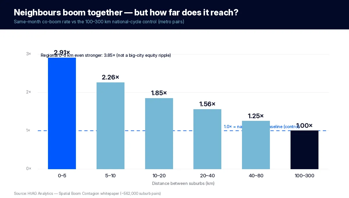
This is real, strong, and worth naming precisely: it is synchronisation. Neighbouring suburbs are like houses on one street in a thunderstorm — when lightning strikes, several lights flicker at once. The lights are not setting each other off; they share the same storm. Whether the co-movement is also transmission — one suburb causing the next — is settled entirely by the timing.
But nothing travels, and nothing leads
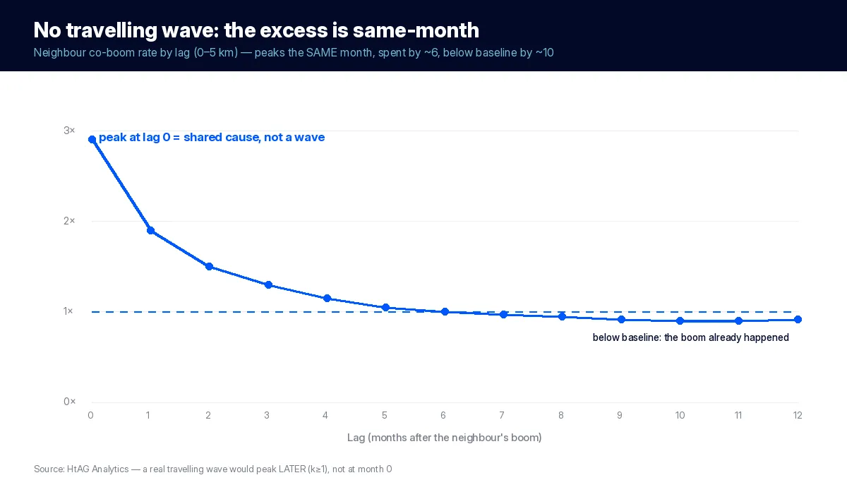
Transmission takes time. Equity release, displaced buyers, migration and word-of-mouth all operate over months, so a genuine cascade would peak at a positive lag — the wave arriving next door later. The data show the opposite. At every distance the co-boom rate is highest in the same month (lag zero), roughly halves within two months, is back to baseline by about six, and dips below baseline near month ten — because a neighbour that was going to ignite already did, inside the synchronised window.
And there is no leader to follow. Testing every lagged co-boom among near neighbours, the “expensive leads cheap” ordering holds just 49.2% of the time — a coin flip. “Large leads small” is 47.8% (significantly backwards: thin markets re-rate first), and “high status leads low” is 49.6%. The classic ripple direction simply is not there.
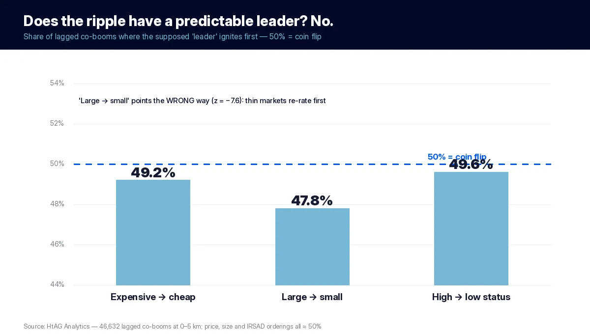
According to HtAG Analytics, across 46,632 lagged co-booms within 5 km the cheaper suburb follows the more expensive one 49.3% of the time — a coin flip. There is no direction to trade.
That the excess is also relatively stronger in nationally quiet months (5.16× within 5 km) pins the mechanism: when the country is calm and a pocket of suburbs ignites together anyway, that is a shared local driver — a regional economy, an infrastructure catalyst, a supply squeeze — firing several adjacent markets at once, not one suburb triggering the next.
The window closes before you can act
Suppose, against all the evidence, that every scrap of the neighbour excess were genuine transmission. Even then it is untradeable. Given a boom, a specific neighbour within 5 km ignites within six months 32% of the time versus 18% expected from the shared cycle — a ceiling of 14 percentage points of “causable” excess. But that excess is front-loaded: by the earliest month an investor could realistically act — index-publication lag plus search, contracts and settlement, roughly three to four months — only 16% (month three) to 8% (month four) of it remains, and by month six just 1%. By the time you discover the neighbour’s boom, the window has closed and, by month ten, reversed.
In a “good LGA”, does every suburb rise?
The most expensive version of the ripple myth is the belief that you can buy anywhere in a “good area” and be carried up. Live HtAG data says otherwise. Here are six adjacent house markets in one northern-Brisbane LGA, as at 30 June 2026 — same council, same postcode cluster, all within a few kilometres of each other:
| Suburb | Typical Price | RCS Lower-Risk | RCS Capital-Growth | RCS Overall |
|---|---|---|---|---|
| Wavell Heights | $1,848,773 | 94 | 94 | 85 |
| Aspley | $1,531,623 | 92 | 84 | 84 |
| Boondall | $1,199,266 | 78 | 87 | 81 |
| Geebung | $1,313,183 | 79 | 89 | 81 |
| Zillmere | $1,175,556 | 36 | 41 | 47 |
| Chermside | $1,395,270 | 20 | 23 | 27 |
Source: HtAG Analytics, houses, as at 30 June 2026 (High confidence).
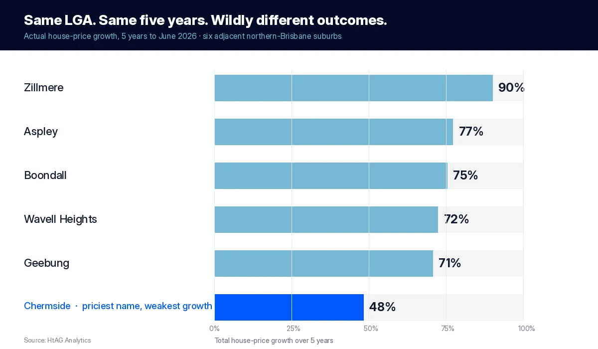
Realised growth tells the same story. Over the five years to June 2026 these adjacent suburbs grew between 48% (Chermside) and 90% (Zillmere) in house prices — the same LGA, nearly double the growth at one end versus the other, with the priciest name the weakest performer. The “a good area lifts everything” story cannot survive that spread.
One postcode, eight different markets
The divergence is not confined to one metric. Pull the full HtAG warehouse on these six neighbours and they separate on every independent axis — realised growth, forward score, new supply, tenure mix, socio-economics, vacancy and risk:
| Measure (houses, 30 June 2026) | Spread across the six adjacent suburbs |
|---|---|
| Actual 5-year price growth | 48% (Chermside) → 90% (Zillmere) |
| RCS Overall | 27 (Chermside) → 85 (Wavell Heights) |
| Forward capital-growth score | 23 → 94 |
| New-supply pipeline (building-approvals ratio) | 0.2% → 3.0% (Chermside) |
| Unit-to-house mix (UH ratio) | 8% → 78% (Chermside) |
| Socio-economic band (IRSAD decile) | 3 → 10 |
| Vacancy rate | 0.3% → 1.5% |
Source: HtAG Analytics, houses, as at 30 June 2026 (High confidence).
The tell is the “premium” name itself. Chermside — the biggest, best-known centre of the six — is the weakest performer on realised growth (48%) and the lowest-scored (RCS 27), because beneath the postcode it is a renter-heavy, higher-density precinct carrying the group’s largest new-supply pipeline (a building-approvals ratio near 3.0% and a unit-to-house ratio of 78%) — structurally nothing like its house-dominated neighbours. Price and reputation pointed one way; the fundamentals pointed the other. A “ripple” or “good-postcode” strategy buys the reputation; only suburb-level data sees the divergence.
What this means in plain English
Eight independent measures — realised growth, forward score, new supply, tenure mix, socio-economic band, vacancy, volatility and price — and these six neighbours diverge on every one. That dispersion is exactly what the “ripple” and “good area” stories ignore, and it is precisely where a suburb purchase is won or lost. You cannot see it from a postcode; you can only see it in the data.
This mirrors our wider analysis of LGA versus suburb data: across 196 council areas the growth gap between the best and worst suburb inside a single LGA averages 47–60 percentage points over five years — and in Ipswich it reaches 271. An LGA average is never suburb-level reality.
The Relative Composite Score spans 58 points across these neighbours — from Wavell Heights at 85 to Chermside at 27 — and price is no guide to it: the well-known “premium” name Chermside, at $1.4 million, scores the lowest of the group, while cheaper Boondall scores 81. A boom in one of these suburbs tells you almost nothing about the house next door in another. In the research, when a suburb booms only about one in ten of its close neighbours co-ignites; nine in ten do not. The dispersion inside an LGA is exactly where returns are made and lost — and it is invisible if you buy the postcode instead of the suburb.
The four beliefs, adjudicated
Together with the companion study on timing, this research adjudicates the four beliefs that drive most reactive property strategy:
| Belief | Verdict |
|---|---|
| “Buy next to the suburb that just ran — ride the ripple” | Rejected — same-month, leaderless, spent within ~6 months |
| “In a good LGA every suburb rises — suburb choice doesn’t matter” | Rejected — ~9 in 10 neighbours don’t co-ignite; a 58-point RCS spread next door |
| “Market selection matters most, because there’s no wave to ride” | Confirmed — the only repeatable edge is cross-sectional selection |
| “If one suburb declines, its neighbours will follow” | Reframed — neighbours co-bust 9.7×, but same-month, as a shared-local symptom, not a delayed wave |
The declines mirror the booms exactly: neighbour busts co-ignite at 9.7 times baseline in the same month, with the same zero-lag, fast-decay shape. A neighbour’s decline is a same-month symptom of a shared local condition worth diagnosing on its fundamentals — not an incoming wave to escape ahead of.
The edge that survives: selection over adjacency
Read alongside the companion finding that booms are memoryless in time, the picture is now closed: there is no wave to ride in time or in space. What survives is more useful than the myth — a validated map of how strongly, how far and how fast shared drivers move neighbouring markets together, and a twice-proven redirection of attention to the one edge the data endorse: selecting markets on their fundamentals before the driver arrives.
- Reinterpret a neighbour’s boom as a diagnostic, not a signal — several adjacent suburbs igniting together, especially in a quiet national month, flags a shared local driver worth investigating. The opportunity, if any, is in markets that share the driver but have not yet been repriced — found by fundamentals, not adjacency.
- Don’t delegate suburb selection to the LGA — the dispersion inside it is the whole game, as the six Brisbane neighbours show.
- Treat adjacent holdings as one local-factor exposure, not diversified assets — their co-movement is real and same-month, in declines as well as booms.
This is exactly what HtAG is built to do. The Property Intelligence layer scores every market on its fundamentals; the Growth Spillover Effect metric measures how a suburb sits against its LGA as a descriptor, not a wave to chase; and our 14-year Dex backtest put fundamentals-based selection on trial against the entire market, with every call tracked in the Evidence Portal. Map the dispersion yourself on the GeoDex heatmap, and see why the area versus the property is the wrong frame once you know the wave isn’t real.
Surface this data inside your AI agent
The HtAG Developer Portal exposes the suburb-level scores, spatial and cycle data behind this article through MCP (Model Context Protocol) connectors. Investors and buyers agents using Claude, Perplexity, Manus AI, ChatGPT (via custom connectors) or any MCP-compatible AI agent can query it directly — so the AI answers on HtAG’s evidence instead of repeating the ripple myth.
Browse the catalogue at developer.htagai.com and submit the HtAG Developer Portal application — approved members receive an API key and an MCP setup guide.
From data signal to portfolio decision
If there is no wave to ride, selection is the whole job — and selection is what the HtAG platform is built for. The Relative Composite Score and the dispersion inside every LGA are live across every Australian market, so you can tell the Chermside from the Wavell Heights next door.
Start your HtAG Analytics membership → · Apply for Developer Portal access →
Key takeaways
- Neighbours co-boom — 2.91× within 5 km, decaying to the baseline by 100–300 km — but it is synchronisation, not transmission.
- The co-boom peaks the same month (no travelling wave) and has no leader (price/size/status all ≈ 50%).
- Even treated as fully causal, ≤16% of the excess survives to the earliest month you could act; 1% by month six.
- A “good LGA” doesn’t lift every suburb: ~9 in 10 neighbours don’t co-ignite, and RCS can span 58 points next door.
- The only repeatable edge is market selection on fundamentals — proven over 14 years in the Dex backtest.
FAQs
Is the property ripple effect real?
Partly. Neighbouring suburbs genuinely co-boom — within 5 km at 2.91 times the baseline rate — but HtAG Analytics found it is same-month synchronisation to a shared cause, not a travelling wave. There is no delay to act on and no predictable leader, so the ripple is real as a pattern but not usable as a buying signal.
Can I buy next to a booming suburb and ride the wave?
No. The co-boom peaks the same month and is largely spent within six; even under the most generous assumptions, at most 16% of the excess survives to the earliest month an investor could transact, and it dips below baseline by month ten. By the time you discover the neighbour’s boom, you are too late.
Do all suburbs in a good LGA rise together?
No. When a suburb booms, only about one in ten of its close neighbours co-ignite. In live HtAG data, six adjacent northern-Brisbane suburbs show a Relative Composite Score spread of 58 points — with the priciest “premium” name scoring the lowest. Suburb selection cannot be delegated to the LGA.
If one suburb declines, will its neighbours follow?
They co-decline strongly — 9.7 times baseline within 5 km — but in the same month, as a symptom of one shared local condition, not a delayed wave with a lag to trade against. The right response is to diagnose the shared local driver on its fundamentals.
How do I access HtAG spatial and score data inside Claude or Perplexity?
Through the HtAG Developer Portal. Browse the catalogue at https://developer.htagai.com/ and apply at https://links.htag.com.au/widget/form/GFVegAaXzeTUH7QzRl1T. Approved members get an API key and an MCP setup guide so any MCP-compatible AI agent can query HtAG suburb data directly.
Citation: HtAG Analytics — Spatial Boom Contagion whitepaper (spatial co-ignition kernels; 6,229 house markets; ~562,000 suburb pairs; 14,941 boom and 4,924 bust ignitions; January 2007 – May 2026).
The conceptual framework behind this research is published openly for transparency and education. Its proprietary implementation — the calibration, weighting, validation and underlying data behind HtAG’s market-selection scores — remains the confidential intellectual property of HtAG Analytics.
This article forms part of the HtAG Property Intelligence Reference Library — a structured knowledge base documenting the concepts, metrics and methodologies used to analyse Australian residential property markets.
Reference Standard PI-RIPPLE · Version 1.0
Disclaimer: This article is for educational purposes only and does not constitute financial advice. Statistical findings describe historical patterns in the data analysed and are not predictions of future price movements. Past performance is not indicative of future results. Always conduct your own due diligence and consult a qualified professional before making investment decisions.