


Short Summary
In April 2026 HtAG gave a buyers agency 76 market recommendations, split into two lists — one built to move soon, one built to hold for a decade. Five weeks later the Budget rewrote property tax. We went back and marked all 76, including the one that fell and the one whose data broke. Both lists did the job they were built for, and the odds against that happening by chance are hundreds to one on price and thousands to one on rent.
In April 2026, HtAG Analytics handed a well-known Australian buyers agency 76 market recommendations. They came as two separate lists: one built for people who want movement in the next year or two, and one built for people buying something to hold for a decade.
Five weeks later the Federal Budget restricted negative gearing to new builds and replaced the capital gains tax discount. A lot of commentary declared property investing finished.
So we went back and marked every one of the 76 — including the one that fell 7.8% and the one whose data broke. Both lists did the job they were built to do, and the odds against that happening by chance are better than 1 in 500 on price and better than 1 in 5,000 on rent.
We cannot name the client and we cannot name the suburbs; the selections are their property. Everything else is on this page.
Table of Contents
- Why Most Property Track Records Tell You Nothing
- What We Actually Promised in April
- The Scorecard: Four Promises, Four Kept
- Could This Just Be Luck?
- Rent Was the Strongest Result — and the Honest One
- Getting the Suburb Right Is the Easy Half
- The Two That Did Not Behave
- What Everyone Else Publishes
- How the Selection Actually Works
- Who This Matters To
- Surface This Data Inside Your AI Agent
- From Data Signal to Portfolio Decision
- What We Are Not Claiming
- Key Takeaways
Why Most Property Track Records Tell You Nothing
Here is the trap almost every performance claim in this industry falls into.
In a rising market, about 80 to 85% of Australian suburbs go up in any given quarter. That is the normal background rate — 85% of house markets recorded price gains in the year to June 2026, on CoreLogic’s suburb-level figures.
So when a firm tells you “82% of our picks went up”, they have told you nothing at all. That is what the whole country did. You would get the same result throwing darts at a map.
A result only means something if it is measured against every comparable suburb in the country over exactly the same months. Not against a flattering national average. Against the actual spread of every market, side by side.
What This Means in Plain English
If you only remember one thing from this page, make it this. “Most of our picks went up” is not evidence — in a good year most of Australia goes up. The only question worth asking a research firm is: compared to what, over exactly which months? If they cannot answer that, the number is decoration.
What We Actually Promised in April
The two lists exist because two different people are asking two different questions.
The Fast list is for someone who wants their money moving soon. It is scored on what is happening in a market right now — how much is for sale, how quickly it sells, how many rentals sit empty.
The Steady list is for someone buying a hold-for-a-decade asset. It is scored on the bones of a place — who lives there, how long owners stay, what people earn relative to prices, how dependent the local economy is on a single employer. It deliberately avoids markets that have already run hard.
Those are different promises, so they deserve different tests.
The Scorecard: Four Promises, Four Kept
| What the list promised | Fast list | Steady list | Kept? |
|---|---|---|---|
| Fast should grow quicker right now | +4.6% | +1.3% | Yes |
| Steady should fall less when things go wrong | −7.8% worst | −1.9% worst | Yes |
| Steady should be calmer, fewer surprises | spread of 4.9 | spread of 2.6 | Yes |
| Both should keep rent moving | 100% rising | 96% rising | Yes |
Source: HtAG Analytics, 76 market recommendations measured 31 March to 31 July 2026. Medians shown.
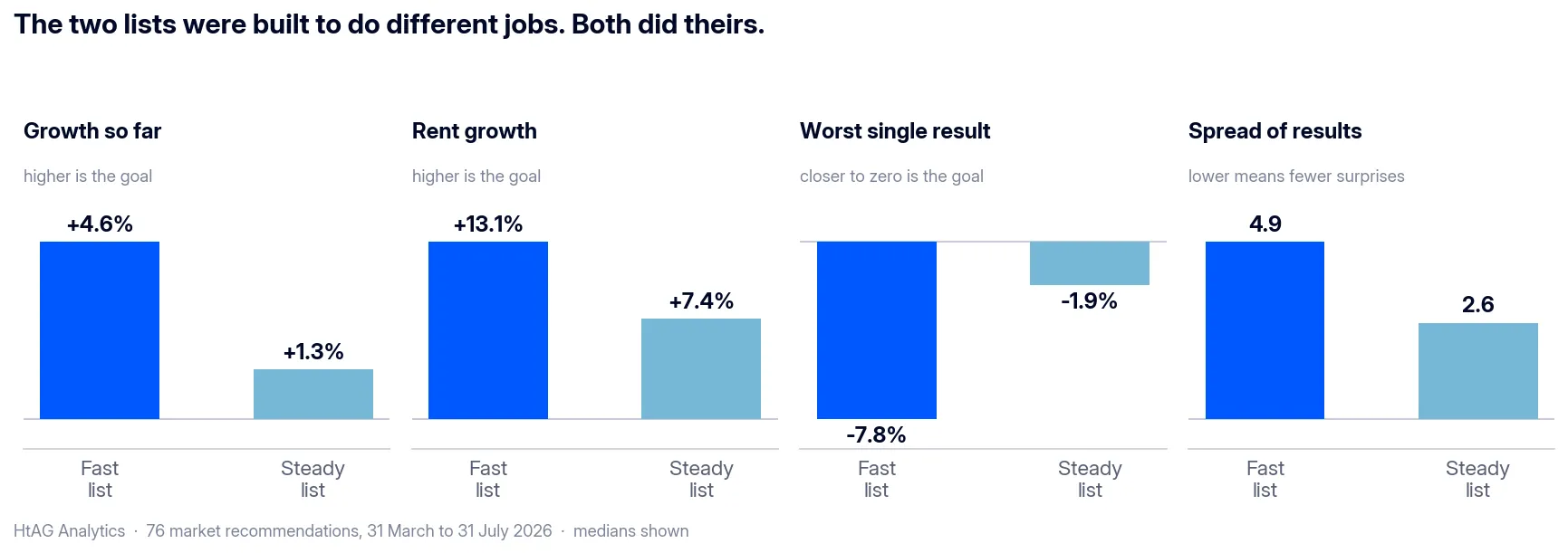
Across the 51 Steady markets that clear our data-quality filter, the worst result anywhere was a 1.9% dip. Not one fell more than 2%. Fifty-one markets, four months, through a Budget that rewrote property tax, and the deepest hole was under two cents in the dollar.
What This Means in Plain English
The labels are not marketing words. A market we called “fast” behaved like a fast buy — more growth, but a bumpier ride. A market we called “steady” behaved like a steady one — less growth, and it barely moved when the market wobbled. Anyone can put two headings on a spreadsheet. The question is whether the markets underneath them behave differently.
Could This Just Be Luck?
Fair question, and it deserves a real answer rather than a shrug.
Here is the test. Take all 76 markets, ignore which list they came from, and shuffle them into two random piles. Measure how far apart the piles land. Then count how often random piles separate as cleanly as the real lists did.
We ran it two ways, because one test on its own is a claim and two is a check. The first shuffles the markets four hundred thousand times and compares the middle of each pile. The second is the Mann-Whitney test, a standard statistics tool that needs no shuffling at all and gives the same answer every time it is run.
The two lists separate at better than 1-in-500 odds on price and better than 1-in-5,000 on rent — and those are the more cautious of the two results in each case, not the flattering one.
According to HtAG Analytics, the separation between its two strategy lists holds at better than 1-in-500 odds on price and better than 1-in-5,000 on rent, on the more conservative of two standard tests, with every market included and nothing removed.
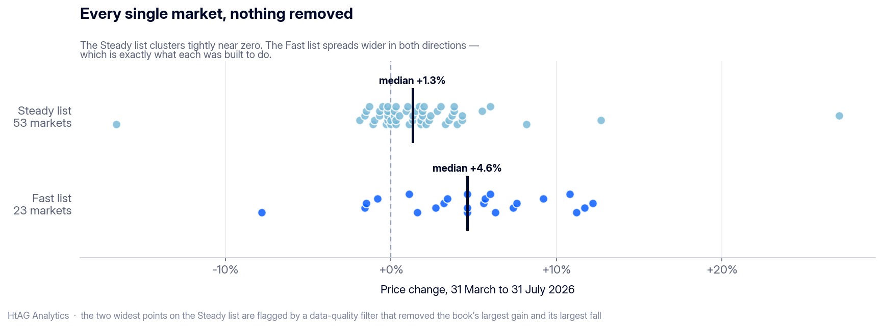
Those figures are calculated with everything left in — the market that fell 7.8%, the market whose data broke, all of it. Apply the data-quality filter and they get stronger, not weaker. No judgement call is propping the result up.
What This Means in Plain English
You cannot get a result like this by accident, and you cannot get it by quietly tidying the list afterwards. What it shows is that the method can tell the difference between a market that is about to move and a market that will hold its value quietly for years — and that those are genuinely two different questions with two different answers.
Rent Was the Strongest Result — and the Honest One
Nobody’s rent went up or down because of the Budget. Rent moves for one reason: more people wanting to live somewhere than there are places to live.
So if this research was genuinely reading conditions on the ground, rather than riding a rising market, rent is where it would show. It showed.
- 74 of 76 markets recorded rising rent.
- On the Fast list it was 23 out of 23 — every single one. Nationally, roughly one market in eight goes flat or backwards over a stretch like this.
- 78% of the Fast list beat the middle of the entire country on rent growth, measured against markets of the same property type over the same four months.
Getting the Suburb Right Is the Easy Half
In 42 of these suburbs the method chose some property sizes and deliberately left others alone — three-bedroom houses but not four-bedroom, for instance.
Same suburb. Same four months. Same everything. The only difference is which one it picked.
The chosen ones beat the ones left behind on rent 28 times out of 42 — about a 1-in-46 result.
What This Means in Plain English
You can buy in exactly the right suburb and still buy the wrong thing in it. Knowing that it is the three-bedroom houses and not the four-bedroom ones is the part that is hard to fake, and it is worth real money at settlement.
The Two That Did Not Behave
An audit that only shows the wins is a brochure. Here are both problems, in full.
The one that actually fell
One market on the Fast list dropped 7.8%.
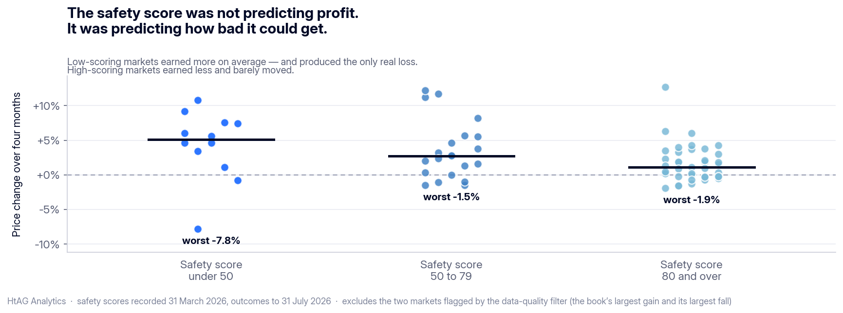
Its safety score — the risk dimension of HtAG’s Relative Composite Score — back in April was 22 out of 100 — near the bottom of everything in the book. And the pattern held right across the range:
| April safety score | Typical four-month result | Worst result in that group |
|---|---|---|
| Under 50 | +5.1% | −7.8% |
| 80 and over | +1.1% | −1.9% |
The low-scoring markets earned more on average and produced the only real loss. The high-scoring markets earned less and structurally could not fall far.
What This Means in Plain English
A safety score is not trying to tell you how much you will make. It is telling you how badly it could go. The markets that scored low earned more on average — and produced the only genuine loss in the book. The markets that scored high earned less and could not fall far. That is a risk measure doing precisely its job.
The one whose data broke
One market shows −16.6%. That figure is accurate in the data and false about the world, and it is worth explaining exactly why.
The entire fall happened in a single month. In that same month, rent went up, and the number of sales jumped 28%. Prices do not drop a fifth in four weeks while rents climb. What changed was which houses were selling, not what the houses were worth.
A data-quality filter caught it. That same filter removed exactly one other market: the biggest winner in the whole book, at +27.1%. A rule that discards your best result alongside your worst is not cherry-picking — and with both left in, it is still 52 of 53 Steady markets that moved less than 2% down.
One more detail worth knowing: that market is no longer on the current list. The screen dropped it at the next quarterly run, without anybody stepping in.
What Everyone Else Publishes
We went looking at what other Australian suburb-research firms put in public. This is not a criticism of any of them — it is a description of an industry-wide norm that we think is worth changing, starting with ourselves.
Testimonials are common. Selected success stories are common. A handful of firms publish dated forecasts that anyone can mark afterwards, and they deserve real credit for that.
But a list of past picks with the measured result of every one, including the ones that did not work — we could not find that published anywhere in the Australian market. Where a firm does promise a scorecard, what we found was either selected highlights or a page still waiting to be filled in.
The academic backdrop is worth knowing too. When Boris Milunovich put 47 different forecasting methods to work on Australian house prices — statistical models, machine learning and deep learning among them — the improvements over a simple random walk at four and eight quarters ahead were, in his words, not statistically significant at any conventional level. The study is Forecasting Australia’s real house price index: A comparison of time series and machine learning methods, Journal of Forecasting, volume 39, issue 7 (2020) — an open pre-print is also available.
That is a national-level finding, and it sets a hard ceiling worth respecting: beyond roughly six months, nobody in that study reliably beat a coin flip. Suburb-level forecasting is harder still, and there is no published Australian study at all measuring how accurate suburb-level growth forecasts really are.
Be careful of a lookalike in the literature, too. There are Australian papers reporting high accuracy at suburb level, but they estimate what a property is worth today from its attributes — mass valuation, a much easier problem than forecasting what happens next. Their accuracy figures do not transfer.
What This Means in Plain English
The unusual thing here is not the size of the edge. It is that the list was fixed before the answers were known, every market is counted, the yardstick is every comparable suburb in the country over the same months, and the result is stated as odds so you can judge for yourself whether it is strong or weak.
How the Selection Actually Works
Every step here — the April lists, the quarterly review, and the current screen — runs on one method: the Dex ranking system, which sorts suburbs across 150+ measures.
Two things about it matter for this audit.
It ranks measures by importance, not by convenience. A small number of measures carry the verdict; the rest refine it or add colour. Nothing gets equal billing just because it is easy to collect.
It reads a different set of measures depending on how long you plan to hold. That is the whole reason the two lists exist and the whole reason they behaved differently. Judging a ten-year selection on a four-month price sprint is the mistake the method is built to prevent — and it is why the Steady list looks unremarkable on growth and outstanding on stability.
None of those measures is a tax setting. They describe the physical and human structure of a place: how much housing exists and where that is heading, how long people stay, what they earn, how exposed the local economy is. A Budget can change the after-tax return on a property. It cannot change how tightly a suburb is held. That is also why the same framework’s public record — 135 tracked recommendations with a 12.4% median annualised return — spans several rate cycles and now a structural tax change. Every one is documented in the Evidence Portal, and the Growth Rate Cycle framework explains the cycle mechanics underneath it.
Who This Matters To
If you are investing, the most expensive thing in property is not a bad suburb. It is not being able to check. Every claim here is written so you can test it: the count, the comparison group, the odds. See how investors use the platform.
If you are a buyers agent, clients are asking harder questions than they were a year ago, and “trust me” has stopped being an answer. A brief you can defend line by line — comparison group named, misses left in — is now a sales asset rather than a compliance chore. This audit is the template; see how buyers agents use it.
If you are a mortgage broker, the hold-or-sell conversations ahead of the July 2027 changeover are easier with structural evidence than with sentiment. See the mortgage broker view.
Surface This Data Inside Your AI Agent
The HtAG Developer Portal exposes the data behind this audit — and every other HtAG dataset — through MCP (Model Context Protocol) connectors. Investors and buyers agents using Claude, Perplexity, Manus AI or any other MCP-compatible AI agent can query HtAG suburb data directly inside the tool they already use.
HtAG’s MCP-enabled Developer Portal puts every measure in this audit inside your AI agent. Apply for access and run the same analysis on any Australian suburb without leaving Claude or Perplexity.
Browse the endpoint catalogue at developer.htagai.com and submit the Developer Portal application — approved members receive an API key and a setup guide for their preferred AI tool.
From Data Signal to Portfolio Decision
The comparison groups, risk scores and cycle-position signals used in this audit are live inside the HtAG Analytics platform — updated as new valuation data flows in. Professional buyers agents use them to time entries, validate briefs, and build conviction before making offers.
If you are building a portfolio and want the exact data powering audits like this one, the HtAG Starter Plan gives you suburb-level analytics across every Australian market — no lock-in, cancel any time.
Start your HtAG Analytics membership → · Apply for Developer Portal access →
What We Are Not Claiming
Saying this out loud is the point, not a hedge.
- Four months is one window, not a track record. It shows the method behaves the way it is designed to. It does not prove it will every single time.
- The rent findings are stronger than the price findings. Price beat the national middle convincingly. The top-quartile and top-10% price results point the right way without being conclusive on their own.
- One good quarter for a ten-year strategy proves it has not broken. It does not prove the ten years.
In a market where a lot of people have recently learned that confident claims can be worth nothing, marking your own limits is the most useful thing a research firm can publish.
Key Takeaways
- HtAG published 76 market recommendations in April 2026 across two strategy lists, then measured every one to 31 July 2026 — misses included.
- Both lists did the job they were built for: the Fast list grew faster (+4.6% vs +1.3% median), the Steady list fell less (worst −1.9% vs −7.8%) and stayed calmer (about half the spread).
- The separation between the two lists holds at better than 1-in-500 odds on price and better than 1-in-5,000 on rent, on the more conservative of two standard statistical tests, with every market included.
- Rent rose in 74 of 76 markets, and in 23 of 23 on the Fast list — the measure a tax change cannot touch.
- The single market that fell carried an April safety score of 22 out of 100, near the lowest in the book; the safety score was pricing downside, not predicting profit.
- Roughly 80 to 85% of Australian suburbs rise in a normal quarter, which is why any track record must be measured against a same-period national comparison group rather than a headline average.
FAQs
Common questions about this audit and how the selection method works.
Not in the measures that matter most. Across 76 markets recommended five weeks before the Budget and re-measured to 31 July 2026, rent rose in 74 of them and the median market grew in price. Rent in particular is not affected by tax treatment — it responds to how many people want to live somewhere versus how much housing exists — which is why it is the cleanest test of whether the underlying selection was sound.
Four things make a track record checkable: the list must be fixed and dated before outcomes are known, every pick must be counted including the failures, results must be compared against a same-period control group of all comparable markets, and the strength of the result must be stated as odds rather than asserted. This audit does all four. Most published property performance claims in Australia do none of them.
The 76 markets were commissioned research for a buyers agency and remain their intellectual property. Each market keeps a consistent code so every figure stays traceable within the audit, and the property type, price bracket and exact result are published for all 76. The selection method itself is public and documented on this site.
Higher than most people assume, and that is the problem. In a rising market roughly 80 to 85% of Australian suburbs record positive quarterly price growth, so “most of our picks went up” is close to the base rate and proves very little. A meaningful claim has to beat a concurrently measured national comparison group — for example, 78% of this audit’s short-horizon picks beat the national middle on rent growth, against a 50% expectation.
Across all 76 markets recommended in April 2026 and measured to 31 July 2026, with every market included and nothing removed, the two lists separate at better than 1-in-500 odds on price and better than 1-in-5,000 on rent — on the more conservative of two standard tests, a 400,000-iteration reshuffle and the Mann-Whitney test. Applying the data-quality filter strengthens both results rather than weakening them, so no judgement call is propping the number up.
Through the HtAG Developer Portal’s MCP connectors. Browse the endpoint catalogue at https://developer.htagai.com/ and submit the application form at https://links.htag.com.au/widget/form/GFVegAaXzeTUH7QzRl1T — approved members receive an API key and an MCP setup guide for Claude, Perplexity, Manus AI and any other MCP-compatible agent, so you can run this audit’s analysis on any Australian suburb without leaving your AI tool.
The evidence in this audit points to timing decisions resting on market structure — supply, demand depth, affordability and cycle position — rather than the tax calendar, because those were the variables that predicted outcomes both before and after the Budget. Holdings purchased before 1 July 2027 are grandfathered under the announced rules. This is general information, not personal advice; the right timing depends on individual circumstances.
Related Concepts
This audit sits inside a wider body of HtAG work on measuring, rather than asserting, research quality.
- What is Property Intelligence? — the layer that converts raw property data into scored, ranked, decision-grade signals.
- Relative Composite Score (RCS) — the score behind the “safety score” column in this audit.
- What is backtesting in property forecasting? — how a method is tested on history, and why that is a different exercise from marking live picks after the fact.
The conceptual framework behind this metric is published openly for transparency and education. Its proprietary implementation — calibration, weighting, validation and the underlying data — remains the confidential intellectual property of HtAG Analytics.
This article forms part of the HtAG Property Intelligence Reference Library — a structured knowledge base documenting the concepts, metrics and methodologies used to analyse Australian residential property markets.
Reference Standard PI-TRACKRECORD · Version 1.0
Disclaimer: This article is for educational purposes only and does not constitute financial advice. Property investment carries risks, and past performance is not indicative of future results. All growth rates, yields, and projections are derived from historical data and statistical modelling — they are not guarantees of future performance. Always conduct your own due diligence and consult a qualified financial adviser before making investment decisions.
